

This happens more often than marketers admit: A business runs ads for months, spends heavily, traffic rises, but leads remain nearly absent. The instinct? Blame the ads-wrong targeting, bad copy. Campaigns are tweaked and relaunched. Results stay the same.
Nobody looks at the website. The real problem is often the website itself.
Jeff Eisenberg, an early conversion optimization expert, said: “It’s much easier to double your business by doubling your conversion rate than by doubling your traffic. Most businesses keep pouring water into a bucket with holes in the bottom.”
Website design mistakes are quiet. They do not announce themselves. The site loads, the logo is there, and the colors look fine. But something is off, and every visitor who lands there feels it, even if they cannot name it. They just leave and do not come back.
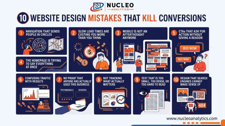
Here are ten of those mistakes, why they happen, and what actually fixes them.
1. Navigation That Sends People in Circles
There is a concept in user experience (UX) design called cognitive load, which is the amount of mental effort a person must spend figuring out what to do next on a website. The higher the cognitive load, the faster people give up.
Menus with many items, dropdowns, vague labels like “Solutions” or “Offerings” increase cognitive load. Visitors will not decode your information architecture; they will simply leave for a competitor whose site makes sense.
Keep the main menu to five items maximum. Use plain language, like “Services,” “Pricing,” “About,” and “Contact.” That is a menu that works. If your site has a lot of content, add a search bar instead of expanding the navigation further. Breadcrumbs on deeper pages help people know where they are and how to backtrack.
Simple navigation is one of those CRO best practices that feels almost too obvious, yet most websites get it wrong.
2. Slow Load Times Are Costing You More Than You Think
Google’s own research found that as page load time goes from one second to five seconds, the probability of a visitor bouncing increases by 90 percent. And yet, the average website still loads in over three seconds on mobile.
For any business running paid traffic, slow load speed is basically lighting money on fire. You pay for the click, the page takes six seconds to load, and the visitor leaves before they see the offer. The most costly landing page error that businesses make occurs when they build landing pages.
Fix the images first, they are usually the biggest culprit. Compress everything without sacrificing visible quality. Remove plugins or scripts that do not earn their place on the page. If your hosting is on the cheapest shared plan, revisit that too.
Run the site through Google PageSpeed Insights, a tool that analyzes website speed. It will tell you exactly what to fix, in order of impact.
3. Mobile Is Not an Afterthought Anymore
Statista reported that in 2024, mobile devices accounted for nearly 60 percent of global web traffic. In industries like food, local services, and retail, that number is even higher. Yet many small business websites are still built desktop-first and feel frustrating to use on a phone.
Tiny text that forces users to squint, buttons that are hard to tap, forms where the keyboard hides fields, and layouts that require horizontal scrolling are common issues that frustrate mobile users and make them leave.
For small business websites, this matters even more because every visitor counts. There is no excess traffic to absorb a poor mobile experience, so even small usability issues can hurt conversions. Mobile usability needs to be a priority.
The best way to spot these problems is to test your site on an actual phone, not just a resized browser window. Many issues only become clear when you use the device the way your visitors do.
4. The Homepage Is Trying to Say Everything at Once
Ask most small business owners what their homepage is supposed to do. They will say something like, “Tell people who we are and what we offer.” The result is a page that tries to cover everything: every service, every benefit, every audience, every message, all at once.
Visitors land there and feel overwhelmed. When everything is fighting for attention, nothing wins. The eye does not know where to go. It goes to the back button.
This common small business website mistake stems from the fear of leaving something out. However, a page with one clear message always outperforms a page trying to communicate ten things poorly.
White space is not wasted space. Removing sections takes courage. But it almost always improves performance.
5. CTAs That Ask for Action Without Giving a Reason
“Submit.” “Click Here.” “Learn More.” These are the three worst CTAs on the internet. They appear on thousands of websites every day.
A CTA should answer one question the visitor is silently asking: What do I get if I do this? “Submit” answers nothing. “Get Your Free Website Audit” answers everything.
This is one of the highest-leverage fixes in conversion rate optimization. It requires no design changes, no development work, and no budget. Just a better copy. Changing one button from “Submit” to something specific and valuable has been shown in repeated case studies to lift conversion rates by 20 to 40 percent or more.
Place the primary CTA where it is visible without scrolling on key pages. Repeat it after making your case on longer pages. On mobile, make the button large enough for a thumb to tap comfortably.
6. Confusing Traffic With Results
This one is less about design and more about mindset, but it shapes a lot of bad design decisions, so it deserves a spot here.
Traffic going up feels like progress. It looks like growth on a dashboard. But the number that actually matters is what percentage of that traffic does something useful- fills out a form, makes a call, or completes a purchase. That is the gap between traffic and conversion rates. It is where most of the real money is hiding.
A site converting at one percent that doubles its traffic is still converting at one percent. But a site that goes from one percent to three percent conversion rate, with no traffic change, has effectively tripled its output from the same investment.
Fix the conversion rate first and then scale traffic.
Fix What’s Stopping Your Visitors from Converting Before You Spend More on Traffic
7. No Proof That Anyone Has Actually Used This Business
Think about the last time you bought something from a brand you had never heard of. What made you trust them enough to hand over your information or your money? Almost certainly, it was something you read from someone else- a review, a testimonial, a rating, or a case study.
People are skeptical by default, especially online. Your job is not to tell them you are good. Your job is to show them that other people already found that out.
Add reviews directly on important pages instead of hiding them on a separate testimonials page that most people never visit. If you have worked with known brands, show their logos to build trust.
Use clear and specific numbers wherever possible. Saying “helped 340 businesses set up proper tracking” is much more convincing than a vague line like “we help businesses with analytics.” This kind of proof makes visitors more confident and more likely to take action.
8. Not Tracking What Actually Matters
This is one of the most expensive mistakes on this list, and it is also one of the most invisible.
A business sets up a website, starts running some marketing, and checks the traffic dashboard. Traffic is up. Great. But are people filling out the contact form? Are they calling? Are they completing a purchase? Without proper conversion tracking, nobody knows.
The importance of conversion tracking is not a technical nicety — it is the difference between making decisions based on real information versus making them based on assumptions. Assumptions in marketing are expensive.
Nucleo Analytics works specifically on this problem. We get tracking set up properly so every action that matters to the business is measured, attributed correctly, and reported in a way that informs decisions. Without that foundation, optimizing anything else is guesswork.
Set up goals in Google Analytics, a platform that tracks website activity. Track form submissions. Track calls if they are valuable to your business. Know what is happening, not just how many people showed up.
9. Text That Is Too Small, Too Dense, or Too Hard to Read
Jakob Nielsen has been studying how people read on the web since the nineties. He has found that people do not read web pages. They scan them. They look for headings, bold text, short chunks, and visual entry points. If they cannot scan and quickly understand what a page is about, they leave.
Long paragraphs with no breaks, body text set at twelve pixels, grey text on a white background, and zero hierarchy between headings and body-these design choices make content harder to consume than it needs to be.
Use sixteen pixels minimum for body text. Line height should give the text room to breathe—about 1.6 times the font size is a solid starting point. Headers must create a visual hierarchy. Short paragraphs will not intimidate people into skipping the whole section.
Readable content keeps people on the page. Time on page is a signal that feeds into both SEO and the likelihood of conversion.
10. Design That Search Engines Cannot Make Sense Of
There is a version of a website that looks great to a human and is essentially invisible to a search engine. No proper heading structure and important content embedded inside images. Pages with thin or duplicated text. No internal linking connecting related content.
These are website design mistakes that compound over time. Every month that a site exists without a proper SEO structure is a month of organic visibility lost.
Small business website design cost often goes entirely toward the visual layer, how it looks, without touching the technical layer that determines whether search engines can crawl and understand it. That is an understandable prioritization on a tight budget, but it is a gap that costs real traffic in the long run.
Use H1 tags above the fold so both users and search engines can quickly understand what the page is about. Add descriptive page titles, and make sure important content is written as actual text instead of being placed inside images.
Internal links also play an important role by helping search engines understand how your pages are connected. None of this is complicated, but it does need to be built into the site from the start.
Get Clear Insights Into What Your Website Is Missing
Most of these mistakes do not look like problems on the surface, which is exactly why they go unnoticed. The site is live, traffic is coming in, everything seems fine until you look at the results and realize something is not adding up.
More traffic will not fix that. It only increases the cost of a problem that already exists. What actually changes outcomes is understanding where visitors drop off, what they engage with, and what is stopping them from taking action.
That is exactly where Nucleo Analytics comes in. Instead of guessing, you get clear visibility into what is happening on your website and where the real opportunities are. Once the data is clear, fixing the right things becomes much easier and far more effective.