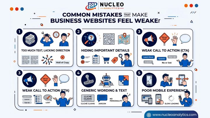


Your business website does not have to look flashy in order for it to work. It requires a structure, it needs to be clear, and there has to be an actionable step directly afterward. Most small businesses only stop at a homepage and contact form, but that isn’t enough. The majority of people use your website to determine whether or not they can trust you.
At Nucleo Analytics, we treat websites as decision tools. Visitors come with simple questions, and your pages should answer them fast. That is where website design services for small business and smart landing page design for lead generation matter.

Why Do These Pages Matter More Than Most People Think?
A website can look good and still fail. That happens all the time. The colors are fine, the photos are clean, the layout is modern, but the site does not actually help a visitor make a decision. It talks around the business instead of saying something useful.
People usually do not spend much time reading a website from top to bottom. They skim. Often, They look for signals. They want quick reassurance. That means your pages have to do more than look presentable. They have to guide people.
A strong website structure helps in a few ways. It makes the site easier to navigate also helps it helps search engines understand what you offer. It gives people a reason to stay longer. And it makes your business feel more real.
The other big thing is trust. If a visitor cannot find basic information fast, they start to wonder what else is missing. A clear website reduces doubt. It gives confidence. It makes the next step feel natural instead of forced.
Good structure also aids in website monitoring continuously. A well-organized site structure lets you catch broken links, form problems, slow pages, or dead sections before they become an issue. It is more difficult to manage a messy website. A more transparent one is easier to maintain.
And of course, a mobile-friendly website is not optional anymore. Most are visiting from mobile phones first. They will click off a site if it is difficult to read, tap, or load slowly.