


What Pages Every Business Website Must Have?
Your business website does not have to look flashy in order for it to work. It requires a structure, it needs to be clear, and there has to be an actionable step directly afterward. Most small businesses only stop at a homepage and contact form, but that isn’t enough. The majority of people use your website to determine whether or not they can trust you.
At Nucleo Analytics, we treat websites as decision tools. Visitors come with simple questions, and your pages should answer them fast. That is where website design services for small business and smart landing page design for lead generation matter.
Why Do These Pages Matter More Than Most People Think?
A website can look good and still fail. That happens all the time. The colors are fine, the photos are clean, the layout is modern, but the site does not actually help a visitor make a decision. It talks around the business instead of saying something useful.
People usually do not spend much time reading a website from top to bottom. They skim. Often, They look for signals. They want quick reassurance. That means your pages have to do more than look presentable. They have to guide people.
A strong website structure helps in a few ways. It makes the site easier to navigate also helps it helps search engines understand what you offer. It gives people a reason to stay longer. And it makes your business feel more real.
The other big thing is trust. If a visitor cannot find basic information fast, they start to wonder what else is missing. A clear website reduces doubt. It gives confidence. It makes the next step feel natural instead of forced.
Good structure also aids in website monitoring continuously. A well-organized site structure lets you catch broken links, form problems, slow pages, or dead sections before they become an issue. It is more difficult to manage a messy website. A more transparent one is easier to maintain.
And of course, a mobile-friendly website is not optional anymore. Most are visiting from mobile phones first. They will click off a site if it is difficult to read, tap, or load slowly.
Essential Pages Your Business Website Should Have
1) Home Page
The homepage is where all browsers first land. It is the page that people usually first see, and most of the time, it will be deciding whether they are sticking around or leaving.
Your simple homepage should explain what your company does. Not clever language. Not vague language. Visitors should know within a few seconds whether they are in the right place.
A good homepage usually includes:
- A clear headline that explains the business
- A short line about who you help or what problem you solve
- Easy-to-find buttons that point people toward the next step
- A simple layout that does not feel crowded
- A design that works well on desktop and mobile
The biggest mistake that people make on their homepage is to put too much! They want it to be a one-size-fits-all explanation for everything. That usually backfires. The homepage should open a space, not finally tell the story.
The point of a homepage is to say what you do right away. If anyone lands on your site and still has to work out what it is that you do, then the homepage is not doing its job. The first couple of pages that you should be well-sharpened up on while upgrading the web design services for a small business.
2) About Page
People want to know who they are dealing with. That is normal. Before they contact you, they usually want to know whether there are real people behind the business.
The About page is where that happens.
This is not the place for stiff corporate language. It should sound human. Tell the story in a way that feels honest. You do not need to write a long autobiography. You just need enough detail to help people feel comfortable.
A solid About page can include:
- Why the business started
- What the team values
- What makes the company different
- A little background on experience
- A reason people can trust you
This page is usually seen as an afterthought by a lot of small businesses. That is a mistake. Often, it is among the most trafficked pages on the site. It is something people check when they are contemplating whether to buy, book, or enquiry.
Your About page is where you create a less polished and more human element to your business. Give people something real. Something readable. Something that reads like a human being wrote.
3) Services or Products Page
This is the page where you explain what you offer. Straightforward, right? Not always. Businesses often make this page confusing because they either say too little or say too much.
Your Services or Products page should be easy to scan. A visitor should not have to read three long paragraphs just to understand what you sell.
Keep it simple:
- Name each service or product clearly
- Explain what it does
- Show the benefit to the customer
- Include a call to action for the next step
If you offer multiple services, break them into sections. Group similar things together. Do not make people work to understand what is on offer.
This page is especially important when you are using landing page design for lead generation alongside a broader website. A services page can support that work by making your offer easier to understand, while a focused landing page can push one specific action.
Good service pages do not just list features. They explain outcomes. They answer the quiet question in the visitor’s head: why should I choose this business instead of another one?
Turn Visitors Into Customers With Smarter Website Pages
4) Landing Page
A landing page is different from any other pages on the site. Its only function is to get action. A lead. A booking. A phone call. A signup. A download.
This is what makes landing page design for lead generation so critically important. A landing page removes distractions and focuses its prospect’s attention on a single clear call-to-action.
A strong landing page usually includes:
- One clear headline
- One main offer
- A short explanation of the value
- One obvious call to action
- Trust signals such as testimonials, reviews, or results
A lot of businesses make the mistake of sending paid traffic to the homepage. That can work sometimes, but often it is not the best move. A landing page gives you more control. It keeps the message tight. It gives people fewer chances to get distracted.
The best landing pages feel direct. They do not ramble or try They do not try to say everything. They just help the visitor decide.
If the goal is conversions, this page matters a lot. It is one of the most practical tools on a website, especially when the campaign has a clear offer behind it.
5) Blog or Resources Page
A blog is one of the easiest ways to keep your website useful after launch. It gives your business a place to answer questions, share insights, and show that you know your field.
This page does a lot of quiet work. It helps with SEO while also It gives visitors a reason to come back. It can warm people up before they contact you. And it gives your website more depth than a handful of static pages ever could.
You do not need to publish every week. You just need helpful content.
Good blog ideas include:
- Common customer questions
- How-to guides
- Industry tips
- Local advice
- Simple checklists
- Mistakes to avoid
- Behind-the-scenes updates
This is also where the best website platform for small businesses matters. Some platforms make blogging easy. Others make it annoying. If you plan to publish content regularly, you need a setup that does not fight you every time you post.
A blog should feel useful, not corporate. Write in a way people actually speak. Keep the tone simple. Keep the ideas practical. That is what gets read.
6) Contact Page
This page is often treated like a formality. It should not be.
If someone is ready to contact you, the process should feel easy. No hunting around or guessing. No endless fields to fill in.
A strong Contact page should include:
- A short contact form
- Email address
- Phone number
- Business hours
- Location, if relevant
- A clear note about what happens after they submit
Keep the form short unless you truly need more information. Long forms can scare people off. A visitor who is already interested should not feel like they are applying for a mortgage just to ask a question.
This page also has to work cleanly on mobile. A mobile-friendly website should make it simple for someone to tap a number, fill a form, or send a message without frustration.
The Contact page is often where interest turns into a lead. Make it easy. Make it obvious and ensure it feels safe
7) Testimonials or Case Studies Page
People trust proof. That is just how it works. They can read all your claims, but what they really want is evidence that you have helped someone before.
That is why testimonials and case studies are so powerful.
A testimonial page may include:
- Client reviews
- Short quotes from customers
- Before-and-after results
- Project highlights
- Specific outcomes where possible
Case studies go a step further. They show the problem, the process, and the result. That kind of story gives people context. It helps them picture what it would be like to work with you.
This is one of the most important pages for website trust. It lets other people do part of the selling for you.
For service businesses especially, this page can make a big difference. A visitor may like your homepage, but a good testimonial page is often what pushes them to take action. It turns a promise into proof.
8) Privacy Policy and Terms Page
Not the most exciting pages. But still important.
A Privacy Policy explains how you collect and use visitor information. A Terms page explains the rules for using your website or services. Together, they make your site look more complete and more professional.
These pages matter even more if your website has:
- Contact forms
- Newsletter signups
- Cookies
- Analytics tools
- Payment systems
Visitors may never read every line, but they notice when these pages exist. It shows that the business is serious and not cutting corners.
When people are comparing the best website platform for small businesses, they often overlook whether the platform makes legal or compliance pages easy to manage. That sounds small, but it matters. You want a website that can grow with you, not one that creates extra headaches later.
What Makes These Pages Actually Work?
Having the pages is only part of the job. The pages still need to be written and built well. A weak homepage with the “right” title is still a weak homepage.
The first rule is clarity. Say what you do in simple language. Do not hide the meaning in clever wording. Your visitor is not trying to admire your copy. They are trying to understand your business.
The second rule is consistency. Your pages should feel connected. The tone, visuals, and calls to action should all point in the same direction. If the homepage sounds friendly and the service page sounds cold, that creates friction.
The third rule is mobile-first thinking. A mobile-friendly website should not just shrink down nicely. It should still be easy to read, easy to tap, and easy to use. That matters more than most people realize. A clunky mobile experience can ruin a strong first impression.
The fourth rule is maintenance. This is where Website monitoring comes in. Pages break. Forms stop working. Links go dead. Plugins cause issues. It happens. Regular checks help you catch those problems before visitors do.
The fifth rule is purpose. Every page should have a reason to exist. If a page does not help a person understand, trust, or act, it probably needs work.
At Nucleo Analytics, we often tell clients that a good site is not built by adding more. It is built by making each page do its job properly.
Common Mistakes That Make Business Websites Feel Weaker
A lot of websites fail for the same reasons. They are not broken in a dramatic way. They are just unclear.
One common mistake is too much text without enough direction. Visitors do not want to dig through walls of copy. They want a clear path.
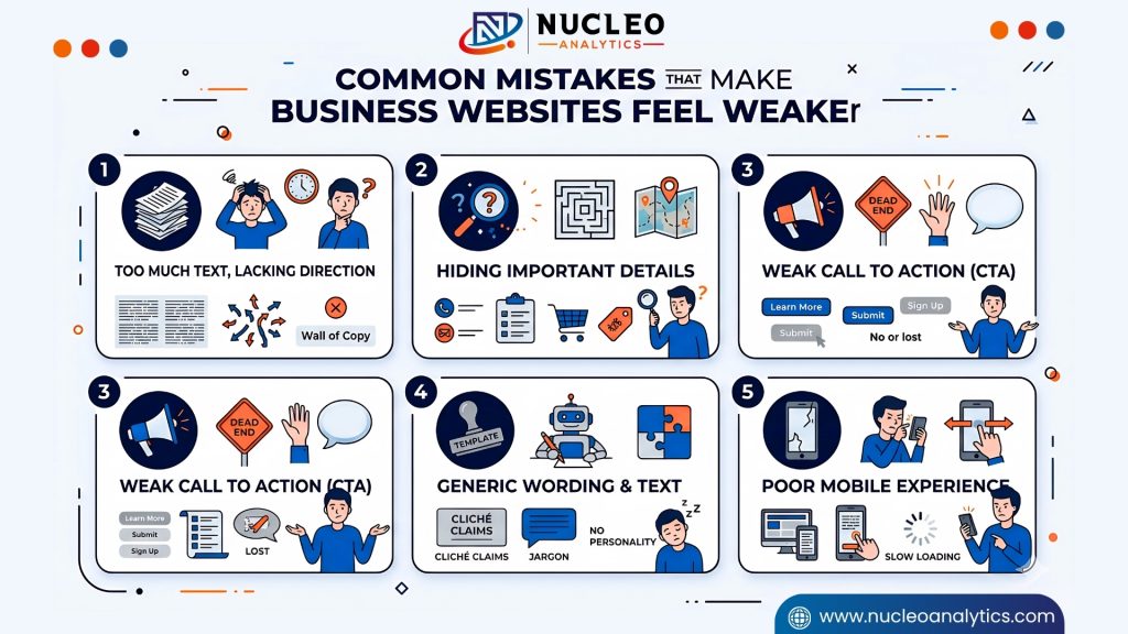
Another mistake is hiding important details. If people have to search for contact info, service descriptions, or proof, they may not bother. Visibility matters.
A third issue is a weak call to action. If every page ends without telling the visitor what to do next, the site feels unfinished.
There is also the problem of generic wording. When every sentence sounds like it came from a template, the business loses personality. People can feel that. They may not say it out loud, but they notice.
And then there is the mobile issue. A site can look decent on a laptop and still be frustrating on a phone. That is a problem. Most traffic now comes from mobile in one form or another, so a mobile-friendly website is part of basic credibility.
Good websites are not built by accident. They are built by paying attention to the details that actually affect how people use the site.
Final Thoughts
A business website does not need to be overloaded to be effective. It just needs the right pages, in the right order, with the right message.
The homepage introduces the business. The About page builds trust. The Services page explains the offer. The landing page turns attention into action. The blog adds usefulness. The Contact page makes it easy to reach you. The Testimonials page adds proof. And the Privacy and Terms pages give the site a more complete, professional feel.
When you combine those pages with a strong structure, smart Website monitoring, and a truly mobile-friendly website, you end up with something far better than a pretty site. You get a website that helps your business move forward.
That is the real goal.
Not just to look established. To actually work like an established business should.
And if you are still choosing tools, planning content, or comparing the best website platform for small business, start here: build the pages people actually need, then make sure each one has a job to do. The rest gets easier after that.
At Nucleo Analytics, that is the kind of website we believe in. Clear. Useful. Built for real people.
Upgrade Your Website Structure For Better Leads And Sales
Frequently Asked Questions
Why are the important pages for website success necessary?
How can website design services for small business help?
What makes landing page design for lead generation effective?
How do I choose the best website platform for a small business?
Why is website monitoring important for business sites?
Why does my business need a mobile-friendly website?
Related Posts

How Website Monitoring Prevents Downtime and Traffic Loss
If you’ve ever opened your site one random morning and it just… didn’t load, you know that awful stomach-dropping feeling.Downtime hits like a punch. Customers […]
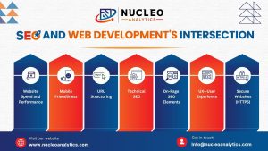
SEO and Web Development: Why is it Important?
A strong online presence is essential for any organization in today’s fast-paced digital environment. Web development and search engine optimization (SEO) are two main foundations […]
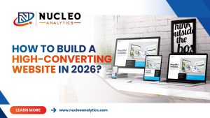
How to Build a High-Converting Website in 2026?
In 2026, a business website has to do far more than look modern. A high-converting website is built with one clear goal. Turn visitors into […]
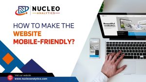
How to Make the Website Mobile-Friendly?
In the fast-paced world of digital marketing and online business, monitoring website performance is crucial to fulfilling consumer expectations, improving their experience, and keeping them […]

10 Website Design Mistakes That Kill Conversions
This happens more often than marketers admit: A business runs ads for months, spends heavily, traffic rises, but leads remain nearly absent. The instinct? Blame […]

What is Technical Optimization in Web Development?
In the digital era, companies trying to have a strong online presence depend on a well-performing website. Still, design of a visually appealing website is […]